I collect ideas everywhere, but the design solution comes from the collaboration in the room: the right people, the brief on the table, and something to react to. Every project moves through the same four stages, and the design solution is documented as a guideline, so what works can be scaled and duplicated.
01
Frame it together
A kickoff workshop before anyone designs: site walk, the brief, what interiors & architecture have done so far, and what the brand needs to say. We leave with shared parameters, not a mood board.
ToolsWorkshop agendas, site walks, the brief, whiteboard
In the roomClient leads, brand team, architects & interiors, agency partner
02
Explore out loud
I sketch live in the room so ideas get tested in minutes, not weeks. Promising directions get pushed further & refined with AI, then narrowed to two or three real options.
ToolsSketchbook & whiteboard, Adobe Creative Cloud, AI assistants
In the roomAgency partner, brand, the people who will use the space
03
Make it real before it's built
Options become 3D models & walkthroughs and full-scale samples, so approvers see exactly what they're agreeing to and decide with confidence.
ToolsSketchUp, physical samples & mockups
In the roomLeadership & brand approvers, facilities, project delivery
04
Turn decisions into a system
The approved direction becomes guidelines, elevations with materials & color matches called out, and vendor agreements, so it can be built right here and repeated anywhere.
Ten case studies, in the order they build the argument
Each one ends with how it maps to the METS role. Click any image to see it full size. Tap a tag to see every project that supports that part of the job.
Case study · Adobe Hooper · the kickoff workshop · 2017–2018
A whole building as one branded experience
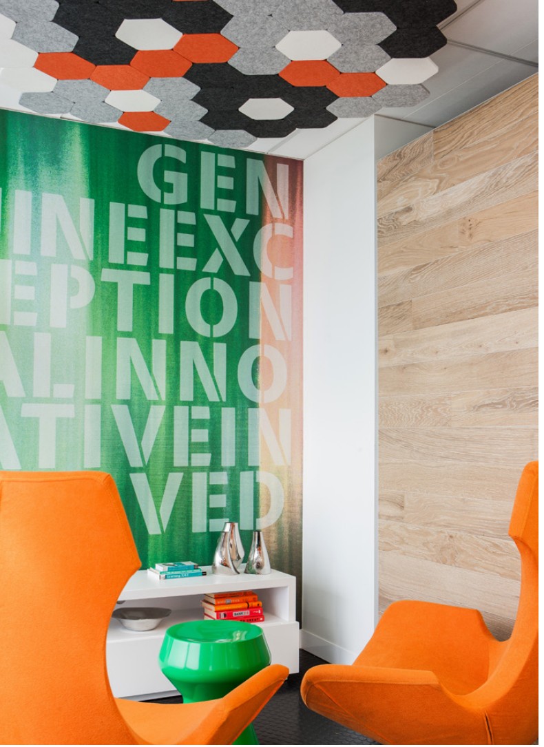
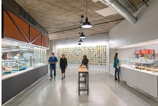
100 Hooper Street was Adobe's new San Francisco office and the largest environmental program I led. Interiors were mostly selected when I came in, so I set up a kickoff workshop that put Gensler, Media-Objectives, Adobe Brand and me in one room; everything in this case study and the next came out of it. The brief: make a brand-new building feel unmistakably Adobe the moment you walk in, without a single wall reading as an advertisement.
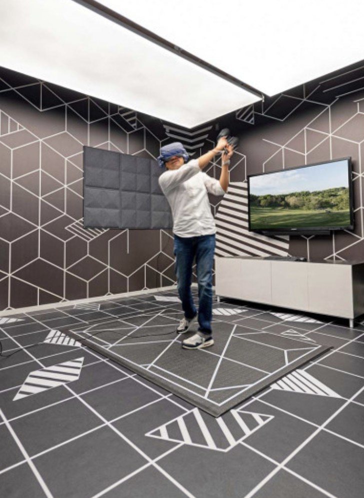
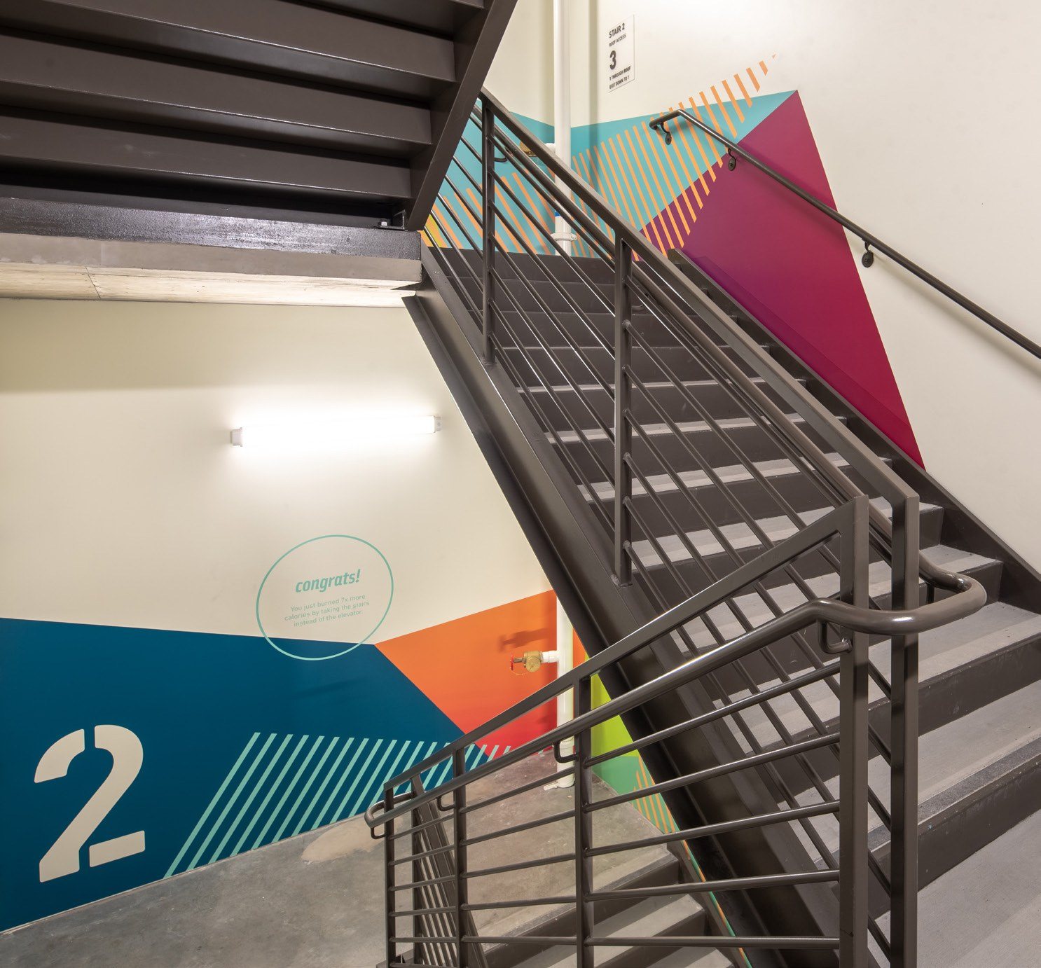
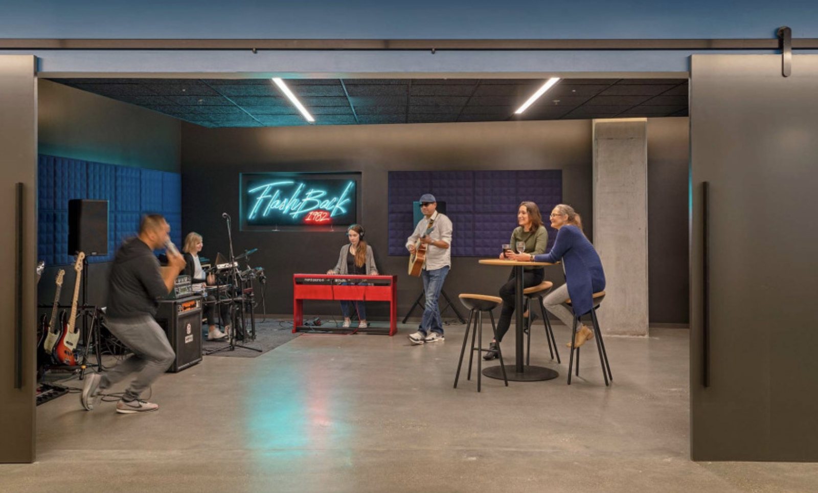
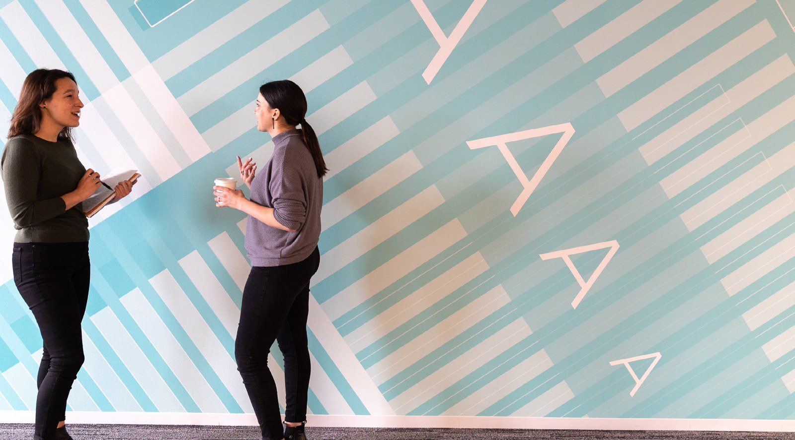
Lobby: the Adobe mark at its final size (see the Aero demo below)VR room: a pattern the headsets trackStair graphicsMusic room, with repurposed event neonProduct-inspired wall covering
$1.07Menvironmental graphics budget, ~$4.25 per sq ft
250,000sq ft across four floors, a lobby, café, 1,500 people
400+graphics & art pieces on every floor: wayfinding, café, murals, wellness
Design decisions
My role
Creative lead & client-side director, concept through punch list
VR room
With Adobe's in-house technologists, my team designed a wall & floor covering that reads as pattern but is 100% unique, so the headsets can track & map the room
Music room
Repurposed a custom neon sign with Adobe's employee events team; employees took it on & activated the room themselves
For METS
A whole building as one story, delivered through an agency partner and dozens of fabricators on a fixed opening date; the same job as a flagship customer experience center
Case study · Adobe Hooper · the lobby mark, in AR · 2018
Showing the architects the mark at true scale
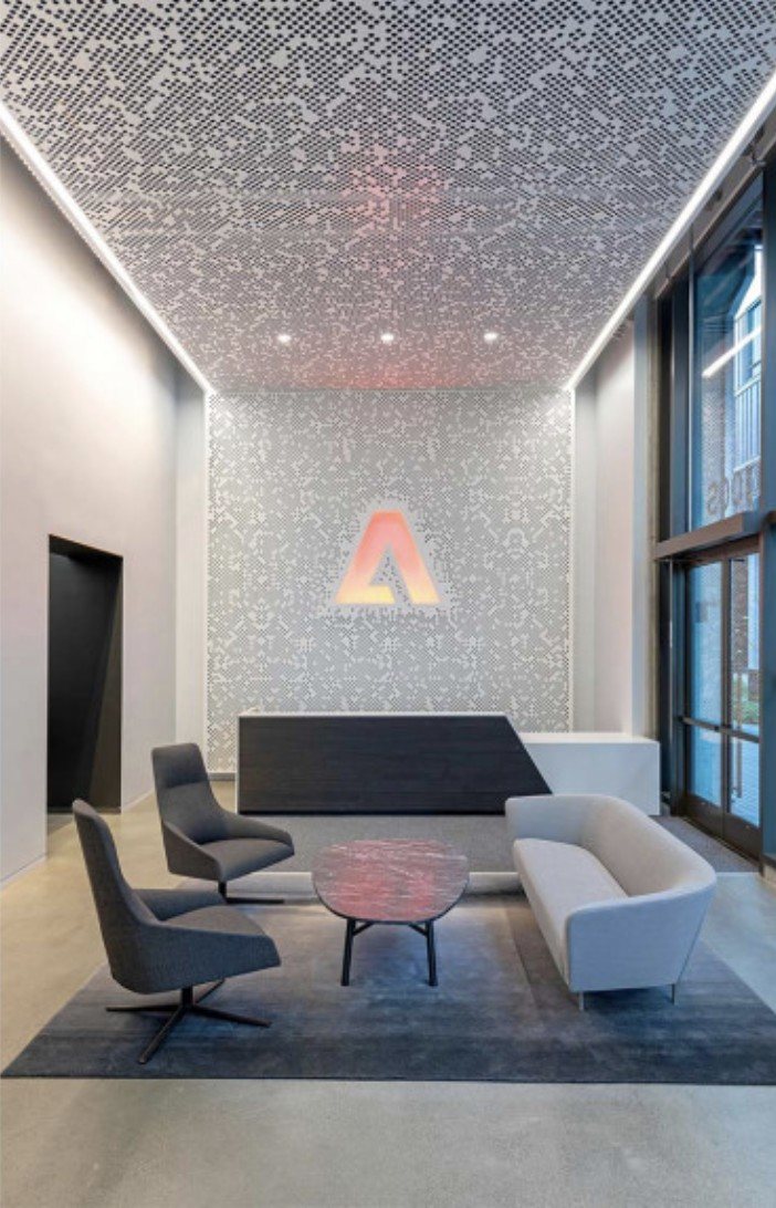
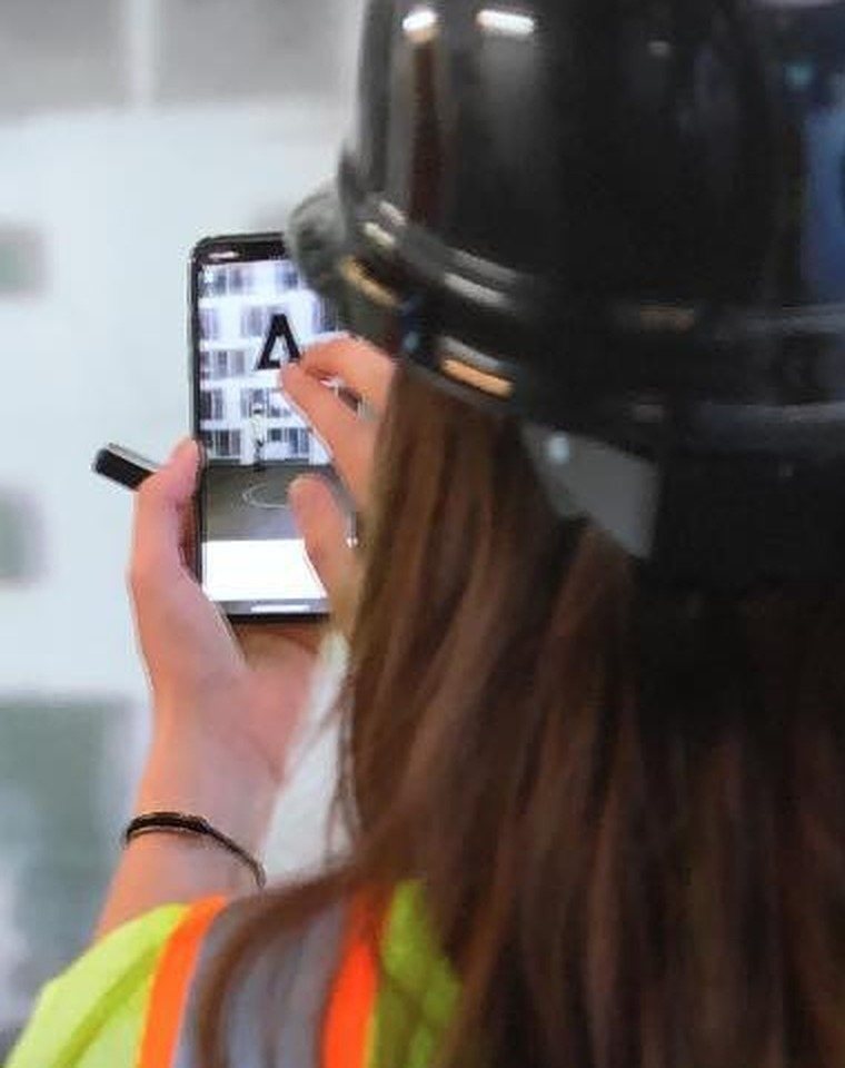
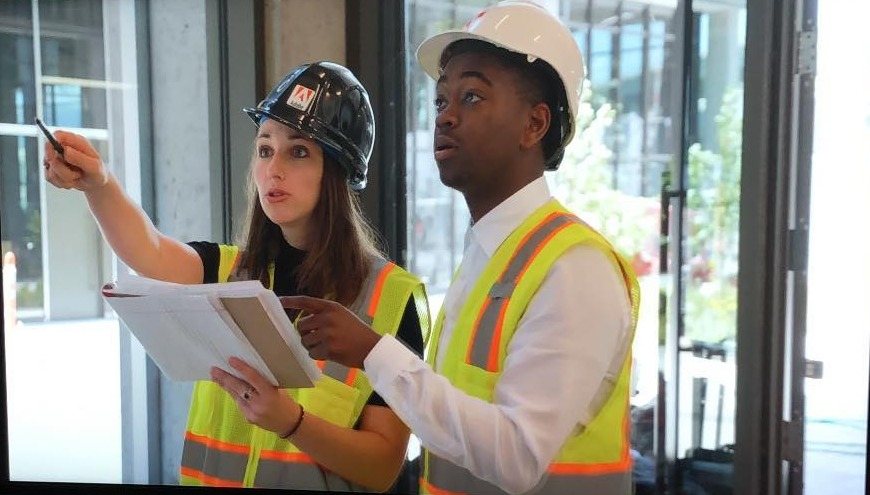
This one did not come out of the workshop; it came out of a disagreement. The architects had proposed the lobby's Adobe mark at a size that looked great on paper, but not great given the volume of the lobby. To show options, I put on a hard hat, opened Project Aero, Adobe's AR beta, and placed the mark on the actual wall at the proposed size, then at a scale we could all agree on. The architects saw it on site and the decision took minutes. Being familiar with the Project Aero team, I shared with them what we had done with the beta, and they knew it would make an awesome case study. They filmed us using the beta, and the demo ran on a loop at their booth at Adobe MAX 2018.
The mark placed on the wall in ARWalking the architects through it on siteThe lobby as built, mark at its final size
Design decisions
The problem
A mark that read well on paper but overwhelmed the lobby in person. I knew we needed more than drawings and a model; this was a great opportunity to use Project Aero
The tool
Project Aero, Adobe's AR beta at the time, used to place the mark in the real room at true scale on a phone
The outcome
The architects saw the problem themselves and the mark was resized on the spot; the Aero team filmed us using the beta and ran the demo on a loop at their Adobe MAX 2018 booth
For METS
Technology used to make a decision physical, on site, in minutes: the whole point of a demo
Case study · Adobe Hooper · from the workshop: wayfinding · 2017–2018
A beautiful wayfinding system and code signage in one package
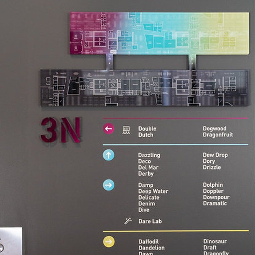
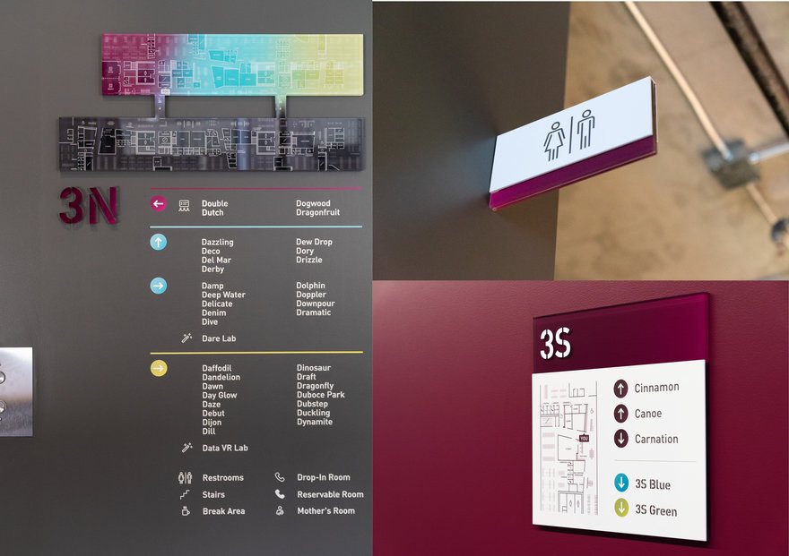
The wayfinding system was the first thing to come out of the workshop. Gensler's San Jose office walked us through the building & their work to date; then Media-Objectives, our environmental graphics & branding partner, Adobe Brand and I iterated & set the parameters for the design. Bringing Adobe Brand in at the start meant they had context through the whole process, not just at approval. The iconography came from Adobe Spectrum, the product's design language, so the building speaks the same visual language as the software.
3N directory, restroom identification and the 3S neighborhood sign
Design decisions
Color wayfinding
Born in the workshop: color pulled from the interior finishes palette, so interiors, brand & signage read as one system. It became the standard for every tier one site built after Hooper.
Mounting
No plaques, no metal standoffs. Signage applied directly to the wall so it reads as part of the architecture.
Iconography
Built in the spirit of Adobe Spectrum, the product's design language, so the building speaks the same visual language as the software.
Scale
The MSA came out of a PM asking for standard numbers to budget a large line item: I set it up with the signage vendor so any office could order & install the system; a companion "Grey Global Package" covered code & ADA when budget called for it.
For METS
The kickoff workshop is how I’d start tackling any design problem: bringing everyone into the room before anything is designed, so decisions hold
Case study · PGA of America HQ, Frisco, TX · with Page · 2020
A visitor journey that carries a century of legacy
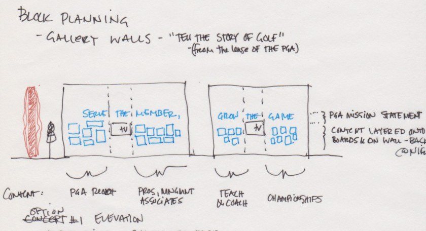
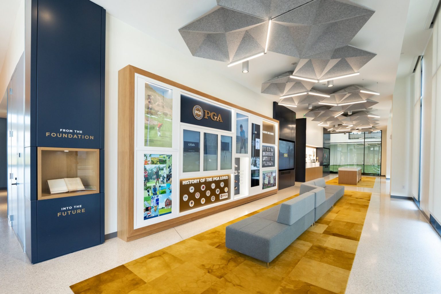
PGA of America wanted its new headquarters to engage visitors along their whole journey through the building. Off the entrance I designed a gallery that tells the founding of the PGA through "The Greats" & the iconic trophies, working with Page Architecture and PGA's team.
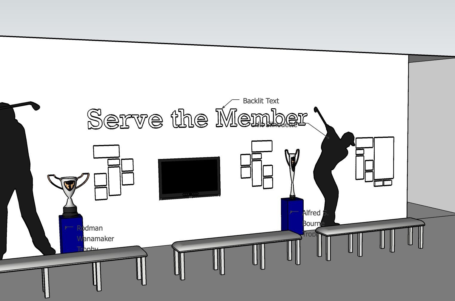
Block-planning sketch: the walls as the storySketchUp option: Serve the MemberFounding-story gallery, as built
Design decisions
Mission as structure
Two walls built on PGA's mission, "Serve the Member" & "Grow the Game," with outreach on one wall & championships on the other, organized under each word
Options to compare
Block-planning sketches first, then two SketchUp directions, modular & silhouette, so the team could compare them side by side
Story at a glance
A screen at the center of each wall & trophies on pedestals, so a visitor gets the story in the first few minutes
Handoff
Page Architecture took the chosen direction through implementation
For METS
An institution's story told in the first minutes of a visit: the core brief of a customer experience center
PGA with brXnded · Executed by Page
Case study · Workplace concept · Confidential client · 2024
From written concept to physical model: a building for deep work
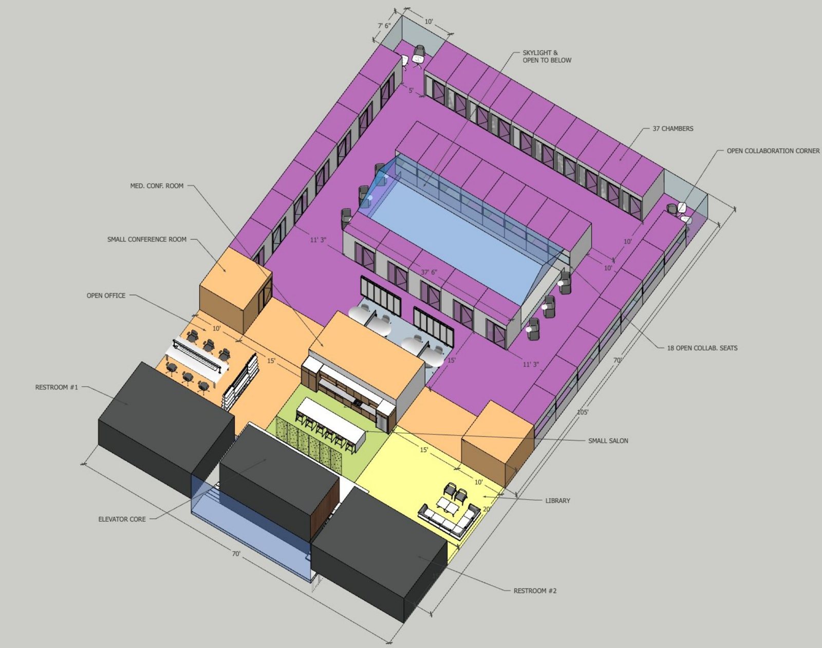
The brief: keep the best of working from home without losing what the office does well. The client handed me an article on the Eudaimonia Machine. I adapted that written concept into a kit of parts, then designed a floor plate with those parts.
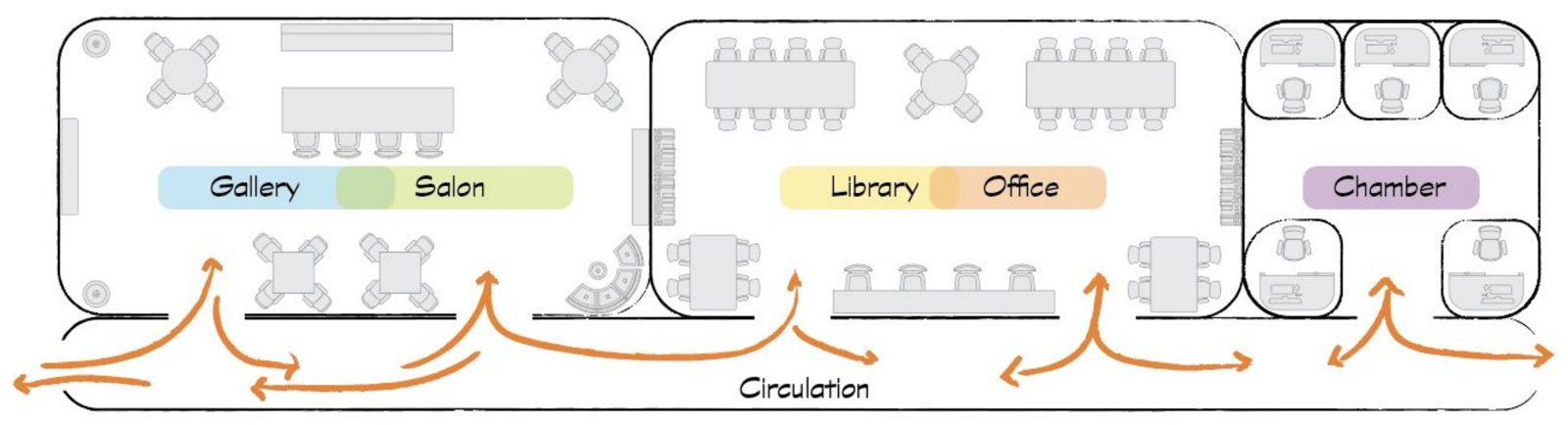
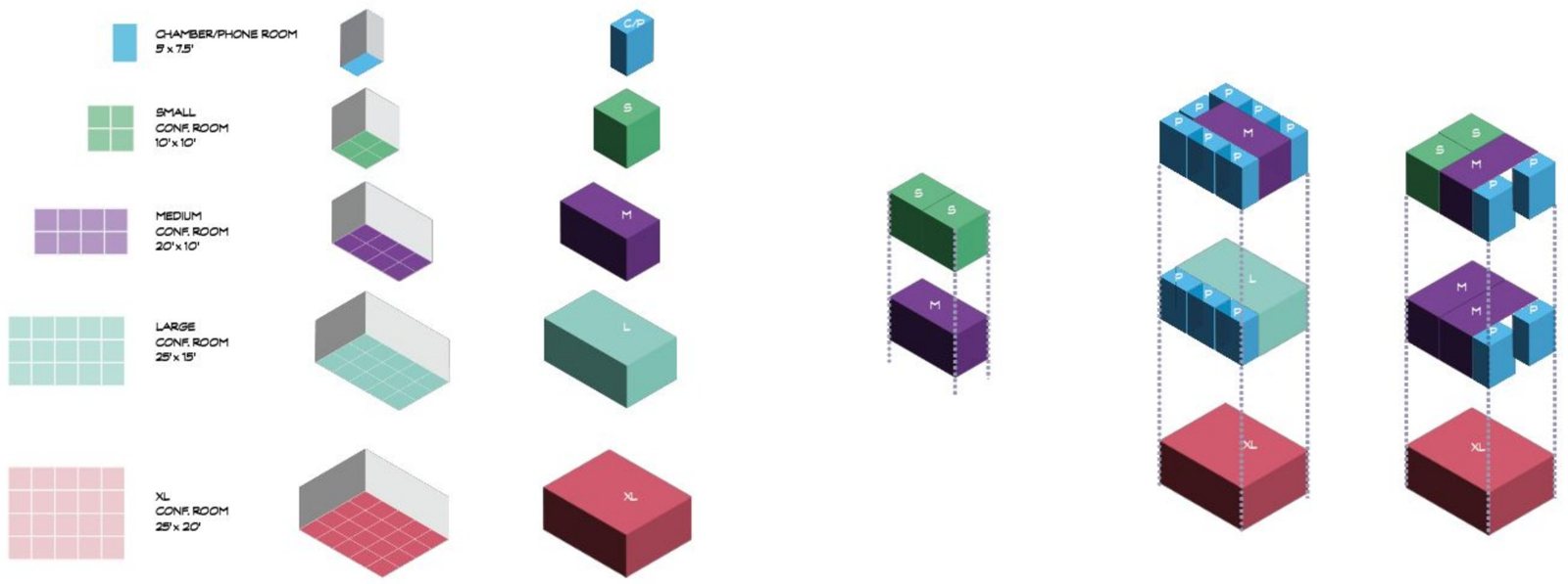
The written concept, adapted: gallery → salon → library → office → chamberKit of parts: five room modules that stack & reconfigureBlocking model of the chambers floor
Design decisions
Sequence
Rooms move from social to focused: gallery, salon, library, office, then private chambers along one circulation spine
Daylight
Every chamber gets natural light, which is why the chambers sit under skylights on the top floor
Kit of parts
Five room modules, from phone room to XL conference, that stack & reconfigure as needs change
For METS
A written concept turned into a planned space through a reusable kit of parts: built once, repeated anywhere
Concept, adjacencies, massing and kit of parts developed and presented in SketchUp · Confidential client
Case study · Real Log · a product built with Claude · 2026
A time log built to survive an audit
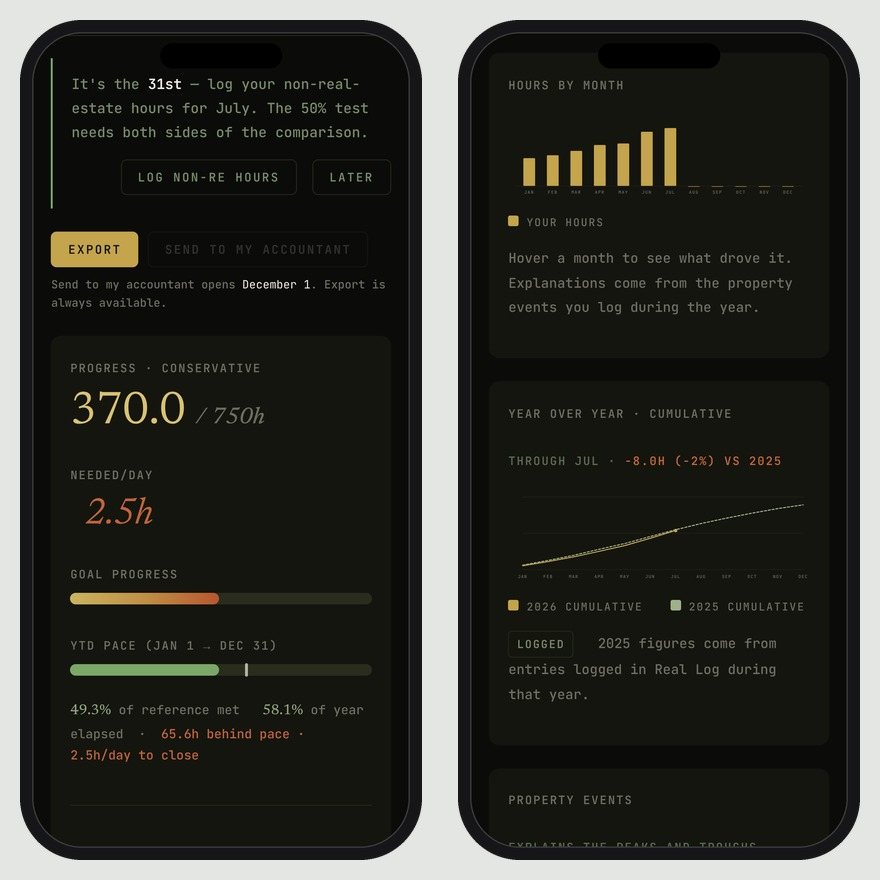
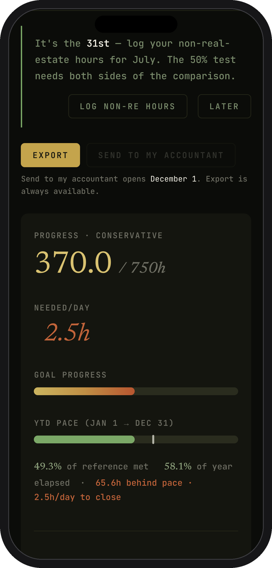
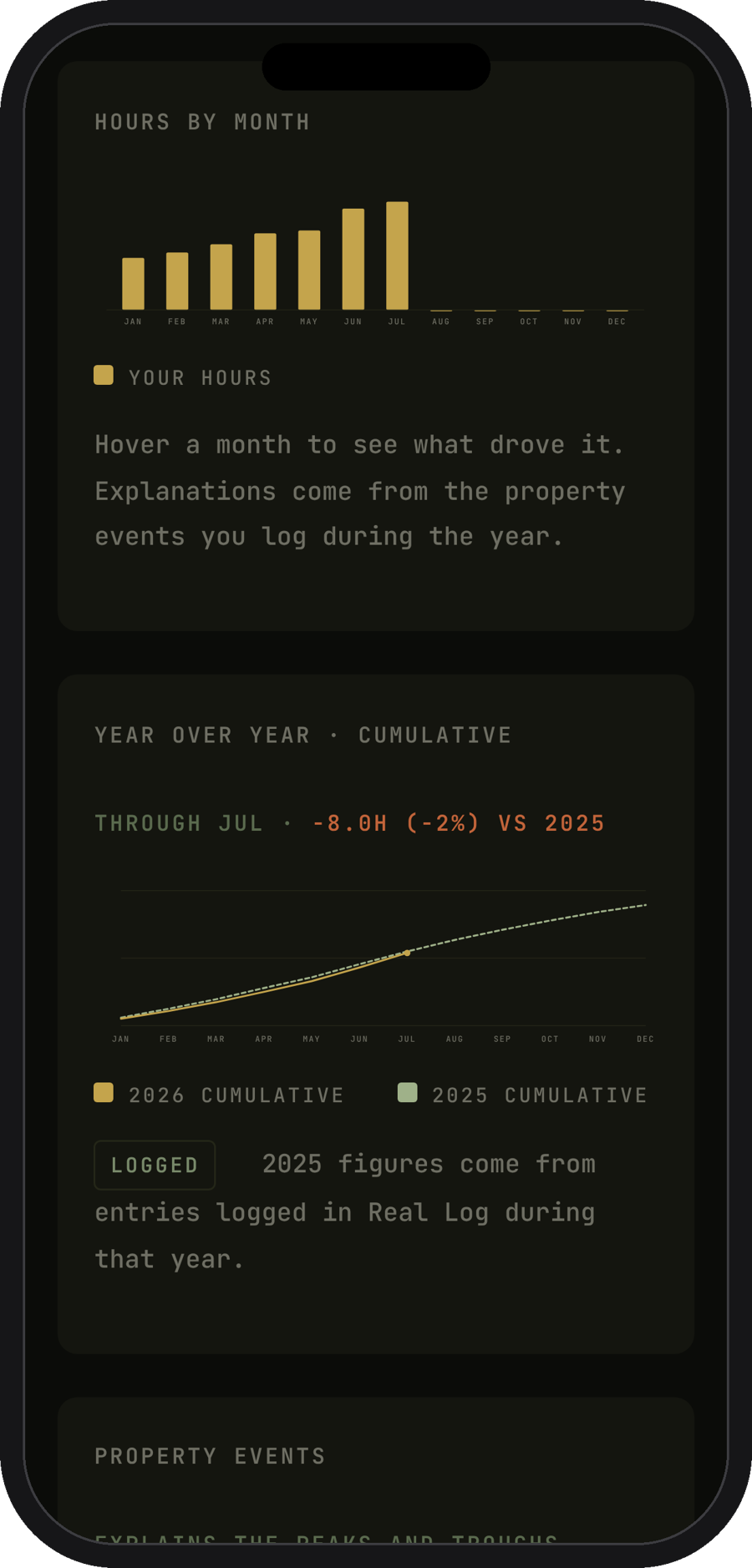
Real estate professional status (REPS) requires proof of 750 hours a year of hands-on work to the IRS, and most people assemble it from memory in April. I am that user. I designed Real Log around what an auditor actually asks for, then built it with Claude: concept, product decisions, interface and a working prototype running on my own 2026 data.
July 31: behind pace, and told what it takes to closeHalf a year logged; the chart already explains itself
Design decisions
Contemporaneous by design
Every entry carries a server timestamp that can't be edited, in quarter-hour steps; the timestamp is what makes a log evidence instead of a reconstruction
The conservative number
The headline total is the lowest defensible figure: logged hours minus travel minus investor-capacity work, with the raw total shown alongside
Events explain the chart
Turnovers, repairs and storms are logged as they happen, so every peak in the monthly chart already has its story attached
Coaching, not errors
Documentation health flags the patterns that attract review, like thin descriptions or 14-hour days, and asks for a note while you still remember
For METS
Designing around what the user has to prove, then building the working demo myself with AI
Product in development · identity, typography & dashboard designed in Claude; prototype built with Claude Code · validation calls underway
Case study · SanDisk HQ · with Valerio Dewalt Train · 2012
Telling a chip company's story in hardware
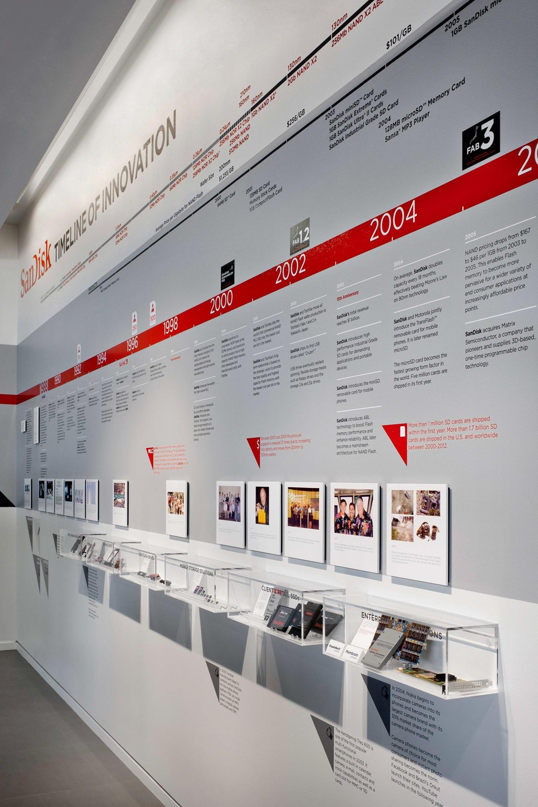
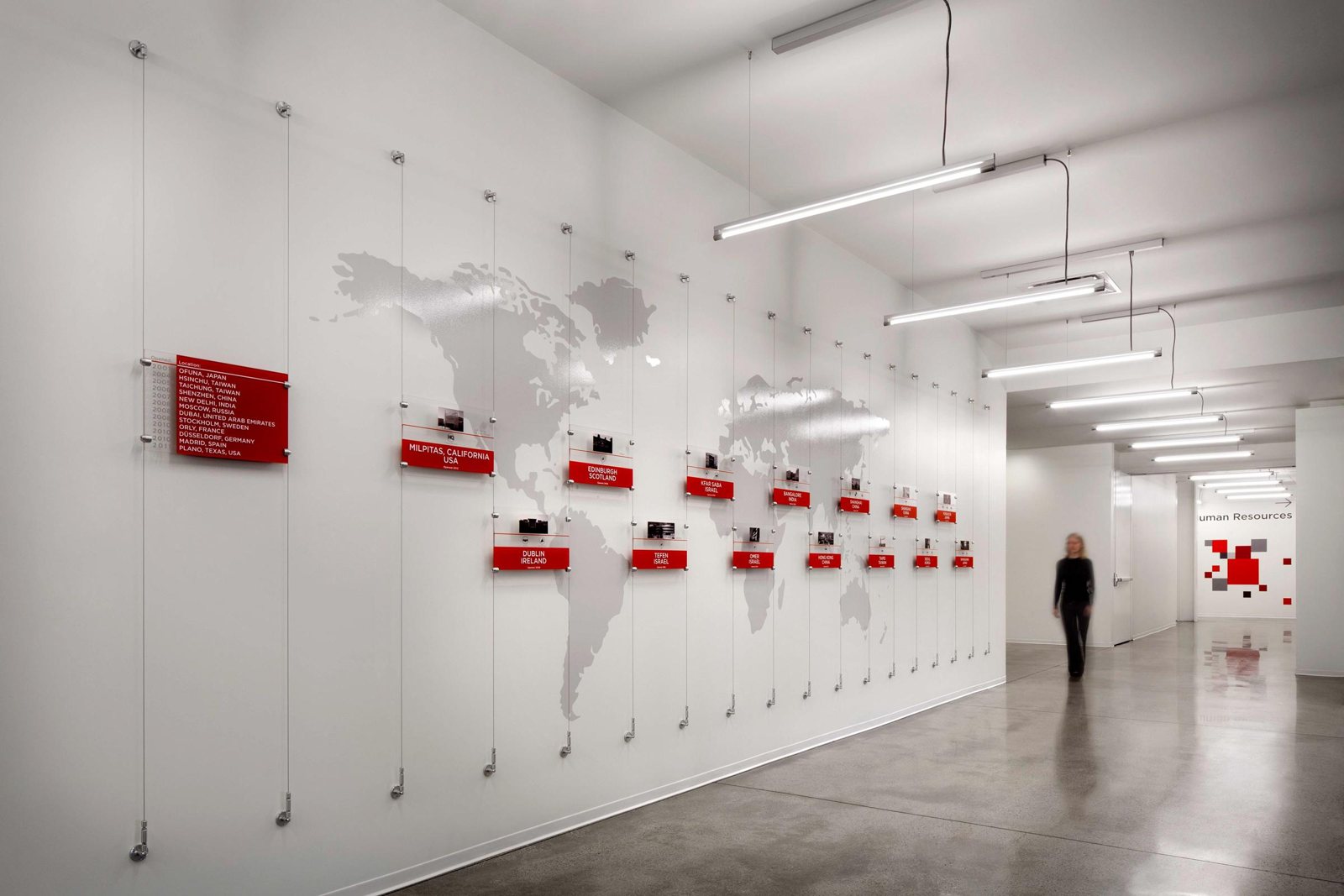
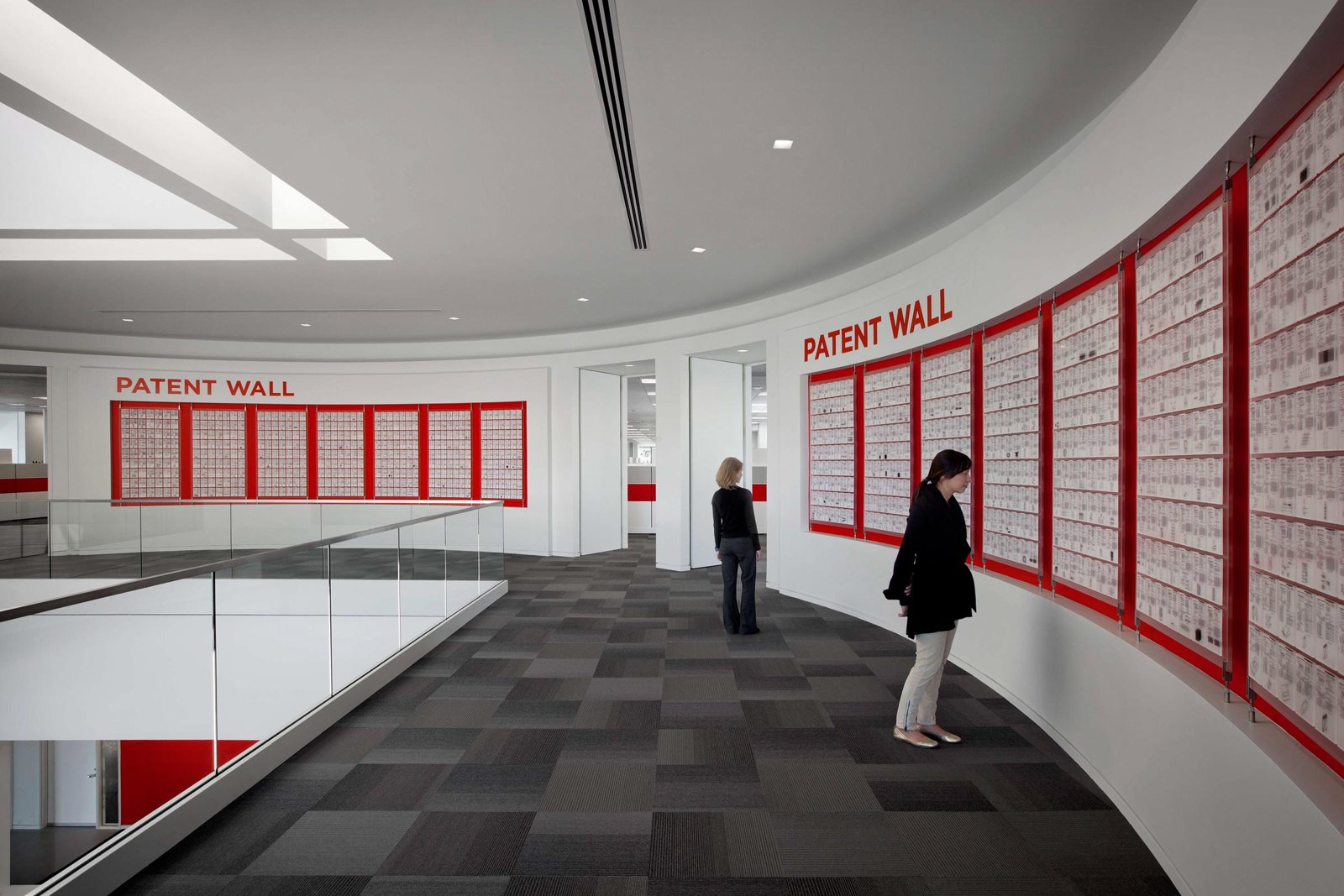
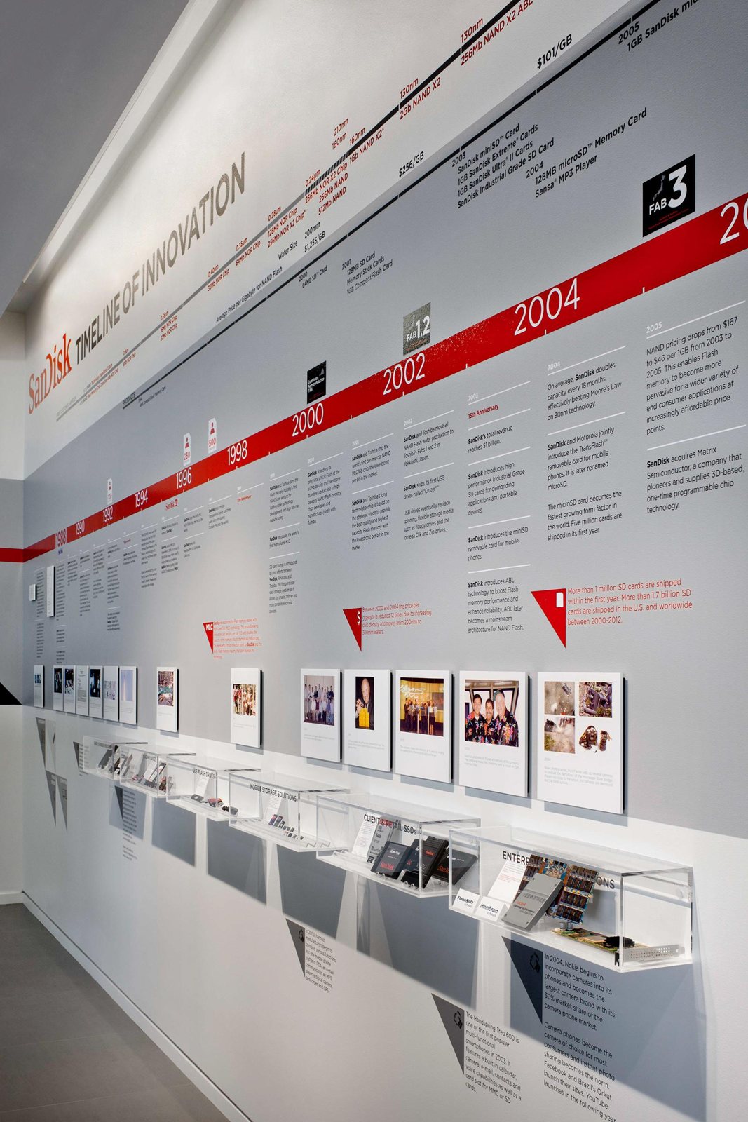
SanDisk was refreshing its campus entry and wanted every visitor to understand the company before their first meeting began. I worked with their communications team to define the SanDisk Story, then gave it three permanent forms: a Timeline of Innovation, a Worldwide Locations wall & a Patent wall.
Worldwide Locations wallPatent wallTimeline of Innovation
Design decisions
The story first
Defined with SanDisk's communications team before design, so the walls say what leadership says in the room
Hardware, celebrated
SanDisk makes chips. The Worldwide Locations plaques & the Patent wall put their hardware on open display, celebrating a hardware company in its own material language
One audience of three
Visiting executives, recruits & employees; each piece had to work for all three, built into the public entry in step with the architectural refresh
For METS
The core job of a customer experience center: make a complex company clear to an executive in the first few minutes
Story development through fabrication & install
Adobe global workplace program · 2013–2019
Raising one creative standard across the globe
For six years I was Adobe's one-person in-house environmental brand design team, responsible for the creative output of every office project in flight. That only works with the right partners, guidelines and processes, with a design brief I wrote for every project, and with staying close enough to the design to pitch it myself.
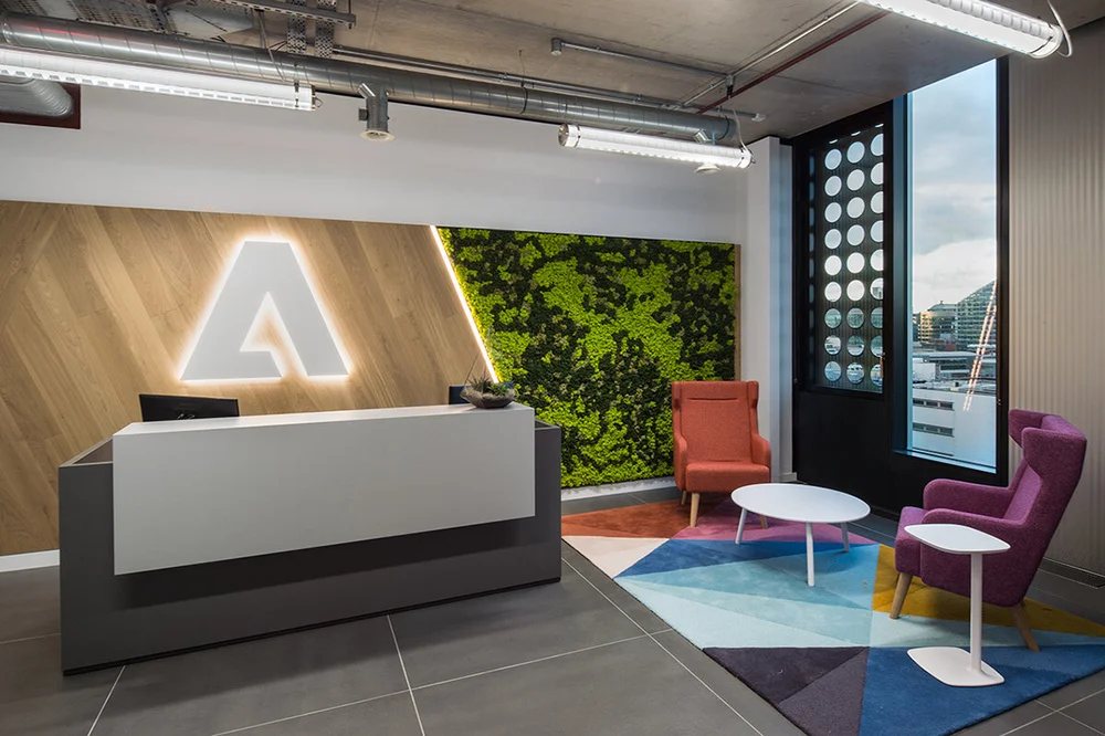
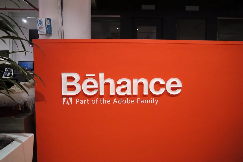
San FranciscoSan JoseNew YorkLondonParisMilanLehiTokyoBangaloreSeoulSydney
London receptionBehance, New York
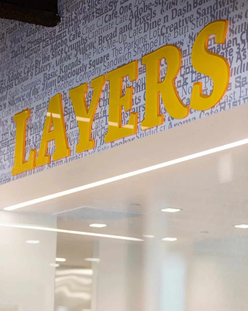
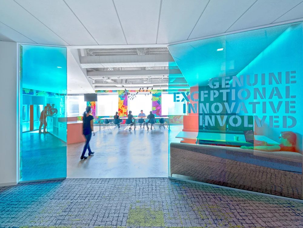
San Jose café, Layers wallOffice entry with colored glass
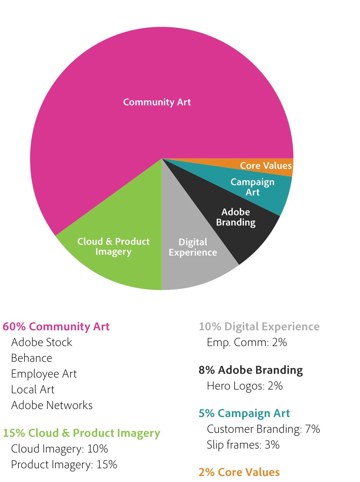
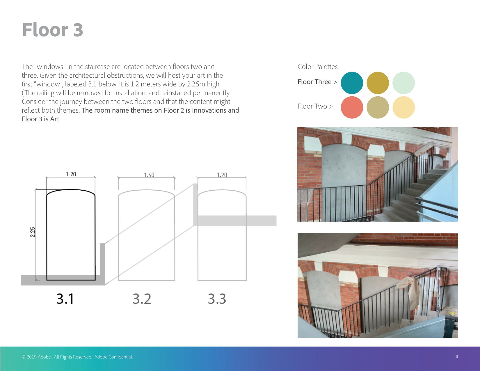
From the guidelines: the content mix every office is programmed to, core values includedParis stairwell artist brief, 2019: the ask, deliverables, kickoff and check-ins; each window measured, with the two floors' themes and palettes the art bridges; colorways by floor, with the gradient the stair runs through
How it held together
Briefs, vendors & fabricators
Every project started from a design brief I wrote: the story, the site, the constraints and what done looks like, so Media-Objectives, a local artist or a fabricator could begin without me in the room. The 2019 brief for the Paris stairwell art is below: the ask, each window measured, a theme and colorway per floor, deliverables and check-ins. Long-term partners got direct feedback at concept, sample & production; a global signage MSA with Serigraphics let any site order & install ADA signage.
Systems that scale taste
Two ADA signage systems, workplace brand guidelines with a catalog of approved graphics & art, quarterly elevator-wrap refreshes, and a process stakeholders bought into, so quality held in cities I could not visit every project.
Local story, every time
Local artists, employee art & custom wallpapers designed by Adobe Design; the brand mark & color palette are the only constants.
For METS
Up to twenty projects at once across 40+ offices, held to one standard by guidelines, a catalog and a global MSA
Program budget 2016–2018: $2.81M across 12 sites and 723,000 usable sq ft, $3.89 per sq ft; per site from $30K (Seoul) to $1.07M (Hooper)
Adobe global workplace program · standards that travel · 2013–2019
Built to refresh: the standards every site shared
Every build-out carried the same set of standards, each one designed once, templated, and handed to the people on site. That is what let 40+ offices refresh their content and keep one look without a designer on a plane.
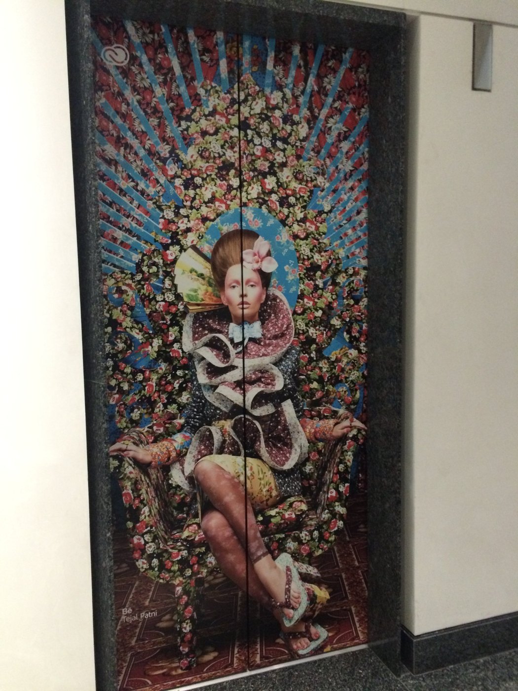
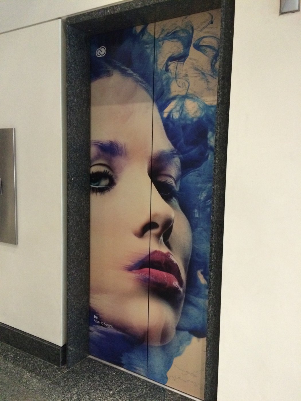
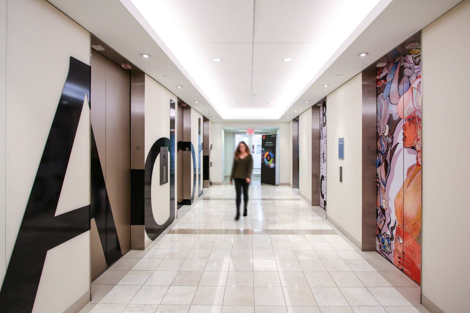
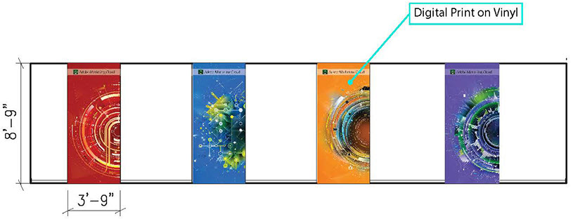
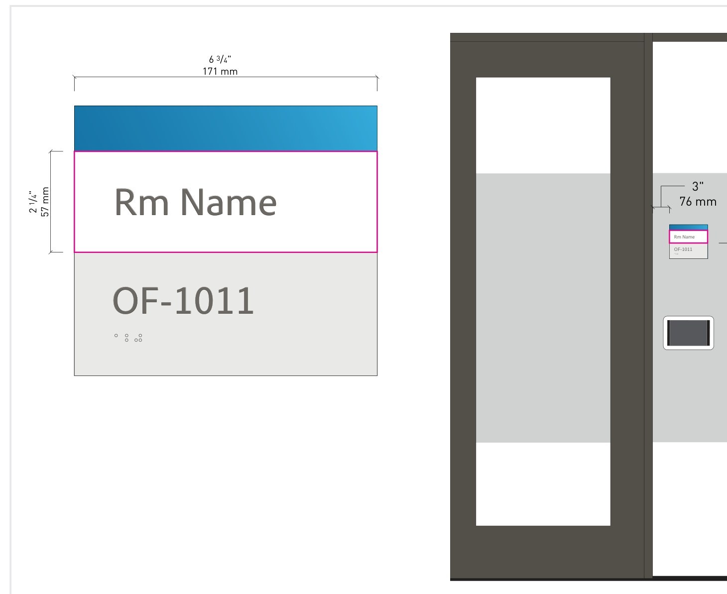
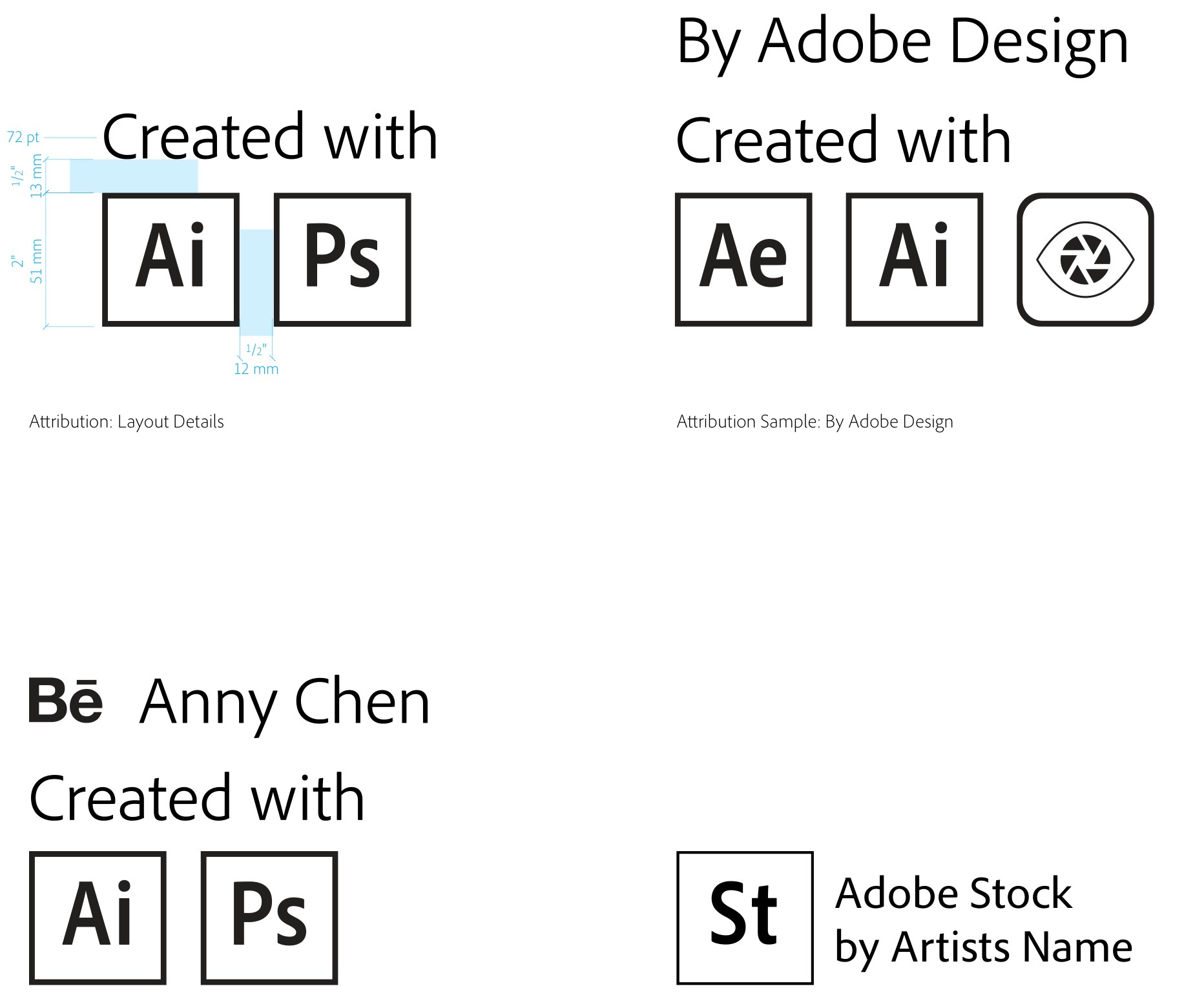
Elevator wrap · Behance art, credited on the doorElevator wrap · Behance artCore values graphic, required in every officeTimes Square: logo on one bank, art on the otherSouth elevation: product art wraps, digital print on vinyl in 3′-9″ door panelsRoom sign: the paper insert facilities prints locally, from the guidelinesArtist attribution template: Behance, Adobe Design, Adobe Stock
The standards
Elevator wraps
Behance & product art printed on vinyl, wrapped on elevator door panels, changed out biannually or to announce a big conference such as Adobe MAX. I produced the template files and coordinated with the vendor to distribute globally, and facilities managers at each office coordinated the install
Core values
Every office carried the core values, always in the same frame in break rooms or as a wall decal, so they read the same in Tokyo as in San Jose
Room & workstation signs
Designed with the facilities team around their needs: a paper insert they print locally & slide in, one look globally with the floor's color gradient
Artist attribution
One template credits the artist & the Adobe tools, whether the piece hangs, is painted on, or is printed into the wallpaper
For METS
Speed to refresh: standards, templates and a local hand-off, so 40+ spaces stay current and cohesive without a project each time
Case study · Adobe Design Summit micro mural · 2017–2018
From a workshop idea to art that can change with the team
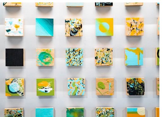
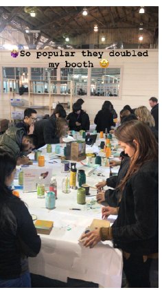
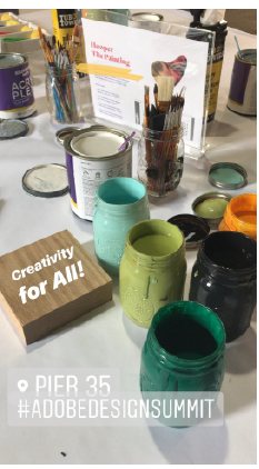
The idea was born in the Hooper workshop. The café needed art, and the first concept was rows of little spice jars. That became one small canvas for each employee to paint, planned from material to install before the summit opened.
The assembled micro muralInstalled in the Hooper café300 attendees painting at the summitThe curated kit of parts
Design decisions & process
Material
Wood panels hung on Z-clips: permanent, but any piece can come down or be swapped, so the installation is future-proofed
Fabrication
Every piece had to be fire rated, so I worked with the vendor on how to cut, form & seal each one
The summit
The installation arrived nearly finished; 300 attendees added their own art at the event
Afterlife
It lives in the Hooper café indefinitely, or until a second revision. As the employee base changes, the art can too
For METS
A guest experience that invites participation and keeps changing after opening day; a demo space should do the same
What I'd bring to METS
The role, matched to work I've done
Six parts of the posting, what I've done in each, and the case studies that show it. Pick one to filter the work above.
Demos & narratives for executives
Live Creative Cloud iPad demos for executives, including Nike's C-suite; Adobe's customer experience center and executive floors; The SanDisk Story
Used Adobe's AR beta, Project Aero, to show architects a logo's scale in real time; the Aero team filmed my demo for its Adobe MAX 2018 booth. Adobe's wayfinding built with Spectrum guidelines, the product's design language
40+ Adobe offices globally, up to twenty projects at once: guidelines, a catalog of approved art and wallpaper designs, two signage systems and a global MSA
Every office project started with the program manager: the architecture, the budget we developed together, and where the signage system fit in it. Then Media-Objectives, Gensler, Page/, sign shops and facilities teams worldwide, from concept through samples, shop drawings and install